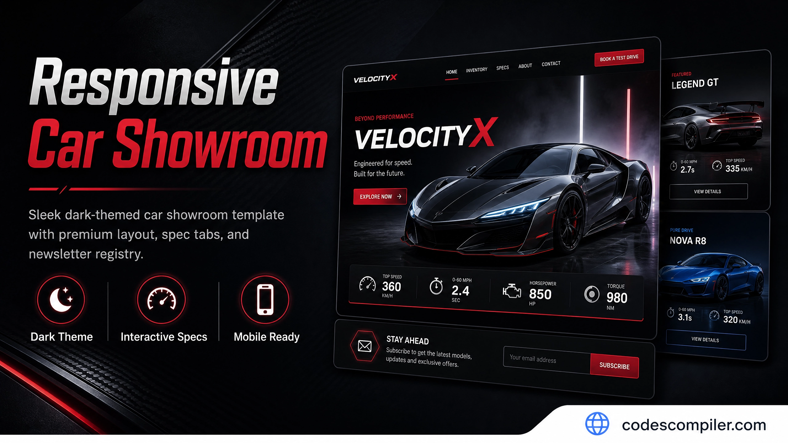
Responsive Car Showroom HTML/CSS Web Template
Download a sleek dark-themed responsive car showroom website template built with HTML and vanilla CSS. Featuring a premium layout, spec tabs, and newsletter registry.
A sleek, dark-themed responsive showroom design tailored for luxury automotive showcase brands. It features carbon-fiber-inspired elements, neon-red accent highlights, active specification tabs, a VIP registry, and grid-based layouts.
HTML Structure
HTML CODE
<header>
  <div class="logo">VELOCITY<span>X</span></div>
  <nav>
    <a href="#" class="active">Showroom</a>
    <a href="#">Inventory</a>
    <a href="#">Configurator</a>
    <a href="#">Innovation</a>
  </nav>
  <a href="#" class="nav-btn">Build Yours</a>
</header>

<!-- VIP Registry Section -->
<section class="vip-registry">
  <div class="vip-content">
    <h2>VelocityX Private Registry</h2>
    <p>Sign up to receive early notifications regarding allocation windows.</p>
    <form class="vip-form">
      <input type="email" class="vip-input" placeholder="Enter your email address" required />
      <button type="submit" class="btn-red">Join Registry</button>
    </form>
  </div>
</section>
Specification Showcase Tabs
Allows users to switch between different mechanical highlights (Performance, Aerodynamics, Safety) dynamically:
HTML CODE
<div class="spec-tabs">
  <button class="spec-tab-btn active" onclick="switchSpec('performance', this)">Performance</button>
  <button class="spec-tab-btn" onclick="switchSpec('aero', this)">Aerodynamics</button>
</div>

<div id="panel-performance" class="spec-content-panel active">
  <div class="spec-panel-text">
    <h3>Power Output</h3>
    <p>Unmatched acceleration performance engineered via synchronous quad-motor drivetrains.</p>
  </div>
</div>
CSS Styling
CSS CODE
.car-tpl {
  background: #06080c;
  color: #f1f5f9;
}
.spec-tab-btn {
  background: rgba(255, 255, 255, 0.02);
  border: 1px solid rgba(255, 255, 255, 0.08);
  color: #94a3b8;
  padding: 12px 24px;
  cursor: pointer;
}
.spec-tab-btn.active {
  background: #f43f5e;
  color: #fff;
  border-color: #f43f5e;
}
.vip-form {
  display: flex;
  gap: 12px;
  max-width: 500px;
  margin: 0 auto;
}
Responsive Layout
CSS CODE
@media (max-width: 768px) {
  header { padding: 20px 24px; }
  nav { display: none; }
  .vip-form { flex-direction: column; }
}