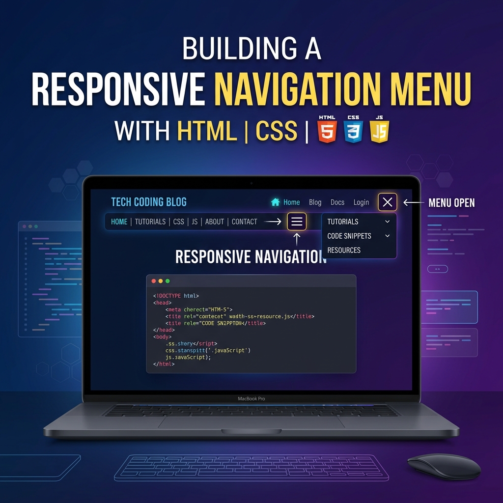
Create a Sticky Navigation Bar using CSS and JS
Learn how to build a dynamic sticky navigation bar that locks to the top of the screen when the user scrolls down.
Table of Contents
Welcome to this tutorial on Creating a Sticky Navigation Bar. A “sticky” navbar stays on the screen even when the user scrolls down a long page. This drastically improves User Experience (UX) because users don’t have to scroll all the way back to the top to navigate to a different page.
In this guide, we will place a navbar below a massive “Hero” image, and use JavaScript to make it stick to the top only after the user scrolls past it.
1. The HTML Structure
We have three main sections: the .hero (which takes up the full screen), the #navbar, and the .content below it.
<!-- Full screen hero section -->
<header class="hero">
  <h1>Scroll Down ↓</h1>
</header>

<!-- The Navbar -->
<nav id="navbar">
  <a href="#" class="logo">Sticky<span>Nav</span></a>
  <ul class="nav-links">
    <li><a href="#">Home</a></li>
    <li><a href="#">Features</a></li>
  </ul>
</nav>

<!-- Long content to allow scrolling -->
<main class="content">
  <h2>Keep Scrolling...</h2>
  <!-- Lots of text -->
</main>
2. The CSS “Sticky” Class
We need a special CSS class that we can toggle on and off using JavaScript. When this .sticky class is active, the navbar uses position: fixed to lock itself to the top: 0 of the screen.
We also add an animation (slideDown) so it smoothly drops into view rather than suddenly popping in.
#navbar {
  background: white;
  padding: 20px 5%;
  display: flex;
  justify-content: space-between;
  width: 100%;
  z-index: 1000;
  transition: all 0.3s ease;
}

/* This class will be applied via JavaScript */
.sticky {
  position: fixed;
  top: 0;
  background: rgba(255, 255, 255, 0.95); /* Slightly transparent */
  backdrop-filter: blur(10px); /* Glassmorphism blur */
  animation: slideDown 0.5s ease-in-out;
}

@keyframes slideDown {
  from { transform: translateY(-100%); }
  to { transform: translateY(0); }
}
3. The JavaScript Logic
Our JavaScript needs to figure out exactly when the user has scrolled past the navbar, and apply the .sticky class.
- Find the navbar element.
- Find the navbar’s
offsetTop(its distance from the top of the page). - Listen to the
window’sscrollevent. - If the user’s scroll position (
window.pageYOffset) is greater than or equal to the navbar’s original position, add the class. Otherwise, remove it.
// 1. Get the navbar
const navbar = document.getElementById("navbar");

// 2. Get the exact vertical position of the navbar
const stickyPoint = navbar.offsetTop;

// 3. Add the scroll event listener
window.addEventListener('scroll', () => {

  // 4. Check scroll position
  if (window.pageYOffset >= stickyPoint) {
    navbar.classList.add("sticky");
  } else {
    navbar.classList.remove("sticky");
  }

});
And that is all it takes! By calculating the offsetTop dynamically, this script works no matter how tall your hero section is. Check out the Live Demo to see the smooth sticky animation in action!