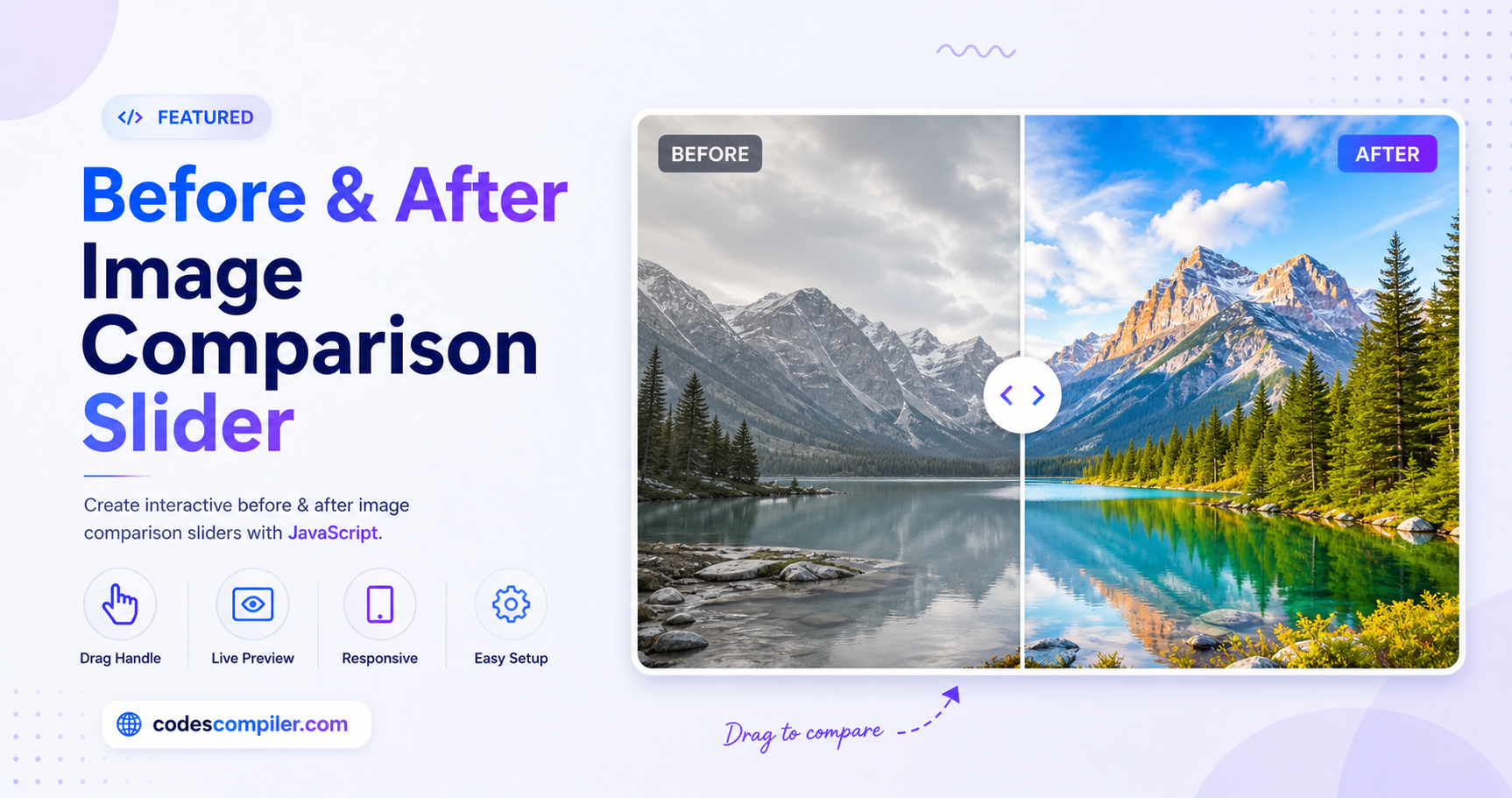
Image Comparison Slider
Build an interactive before-and-after image comparison slider using HTML, CSS, and JS.
Table of Contents
Welcome to this tutorial on Image Comparison Slider.
HTML Structure
<div class="comparison-slider">
  <img src="https://images.unsplash.com/photo-1542224566-6e85f2e6772f?auto=format&fit=crop&w=800&q=80" alt="Before">
  <div class="comparison-overlay" id="overlay">
    <img src="https://images.unsplash.com/photo-1542224566-6e85f2e6772f?auto=format&fit=crop&w=800&q=80&sat=-100" alt="After (Grayscale)">
  </div>
  <div class="comparison-handle" id="handle">
    <div class="handle-line"></div>
    <div class="handle-button">
      <svg xmlns="http://www.w3.org/2000/svg" width="24" height="24" viewBox="0 0 24 24" fill="none" stroke="currentColor" stroke-width="2" stroke-linecap="round" stroke-linejoin="round"><polyline points="15 18 9 12 15 6"></polyline></svg>
      <svg xmlns="http://www.w3.org/2000/svg" width="24" height="24" viewBox="0 0 24 24" fill="none" stroke="currentColor" stroke-width="2" stroke-linecap="round" stroke-linejoin="round"><polyline points="9 18 15 12 9 6"></polyline></svg>
    </div>
  </div>
</div>
CSS Styling
body { margin: 0; padding: 0; display: flex; justify-content: center; align-items: center; min-height: 100vh; background-color: #111; font-family: 'Inter', sans-serif;}
.comparison-slider {
  position: relative;
  width: 100%;
  max-width: 800px;
  height: 500px;
  overflow: hidden;
  border-radius: 15px;
  box-shadow: 0 20px 40px rgba(0,0,0,0.5);
  user-select: none;
}
.comparison-slider img {
  display: block;
  width: 100%;
  height: 100%;
  object-fit: cover;
  pointer-events: none;
}
.comparison-overlay {
  position: absolute;
  top: 0; left: 0;
  width: 50%;
  height: 100%;
  overflow: hidden;
}
.comparison-overlay img {
  width: 800px;
  height: 100%;
}
.comparison-handle {
  position: absolute;
  top: 0;
  left: 50%;
  width: 40px;
  height: 100%;
  transform: translateX(-50%);
  display: flex;
  flex-direction: column;
  justify-content: center;
  align-items: center;
  cursor: ew-resize;
  z-index: 10;
}
.handle-line {
  position: absolute;
  top: 0; bottom: 0;
  width: 4px;
  background-color: white;
  box-shadow: 0 0 10px rgba(0,0,0,0.5);
}
.handle-button {
  position: relative;
  width: 50px;
  height: 50px;
  background-color: white;
  border-radius: 50%;
  display: flex;
  justify-content: center;
  align-items: center;
  box-shadow: 0 0 15px rgba(0,0,0,0.5);
  color: #333;
  gap: -5px;
}
.handle-button svg { width: 18px; height: 18px; }
@media (max-width: 800px) {
  .comparison-slider { height: 350px; border-radius: 0; }
  .comparison-overlay img { width: 100vw; }
}
JavaScript Logic
document.addEventListener('DOMContentLoaded', () => {
    const slider = document.querySelector('.comparison-slider');
    const overlay = document.getElementById('overlay');
    const handle = document.getElementById('handle');
    if(!slider || !overlay || !handle) return;

    let isDragging = false;

    slider.addEventListener('mousedown', (e) => { isDragging = true; updateSlider(e); });
    window.addEventListener('mouseup', () => { isDragging = false; });
    window.addEventListener('mousemove', (e) => { if (isDragging) updateSlider(e); });

    slider.addEventListener('touchstart', (e) => { isDragging = true; updateSlider(e.touches[0]); });
    window.addEventListener('touchend', () => { isDragging = false; });
    window.addEventListener('touchmove', (e) => { if (isDragging) updateSlider(e.touches[0]); });

    function updateSlider(e) {
        const sliderRect = slider.getBoundingClientRect();
        let x = e.clientX - sliderRect.left;

        if (x < 0) x = 0;
        if (x > sliderRect.width) x = sliderRect.width;

        overlay.style.width = `${x}px`;
        handle.style.left = `${x}px`;
    }
});