Design an Animated Dropdown Menu in CSS
Learn how to build a smooth, beautifully animated dropdown menu using pure CSS and HTML. No JavaScript required!
Table of Contents
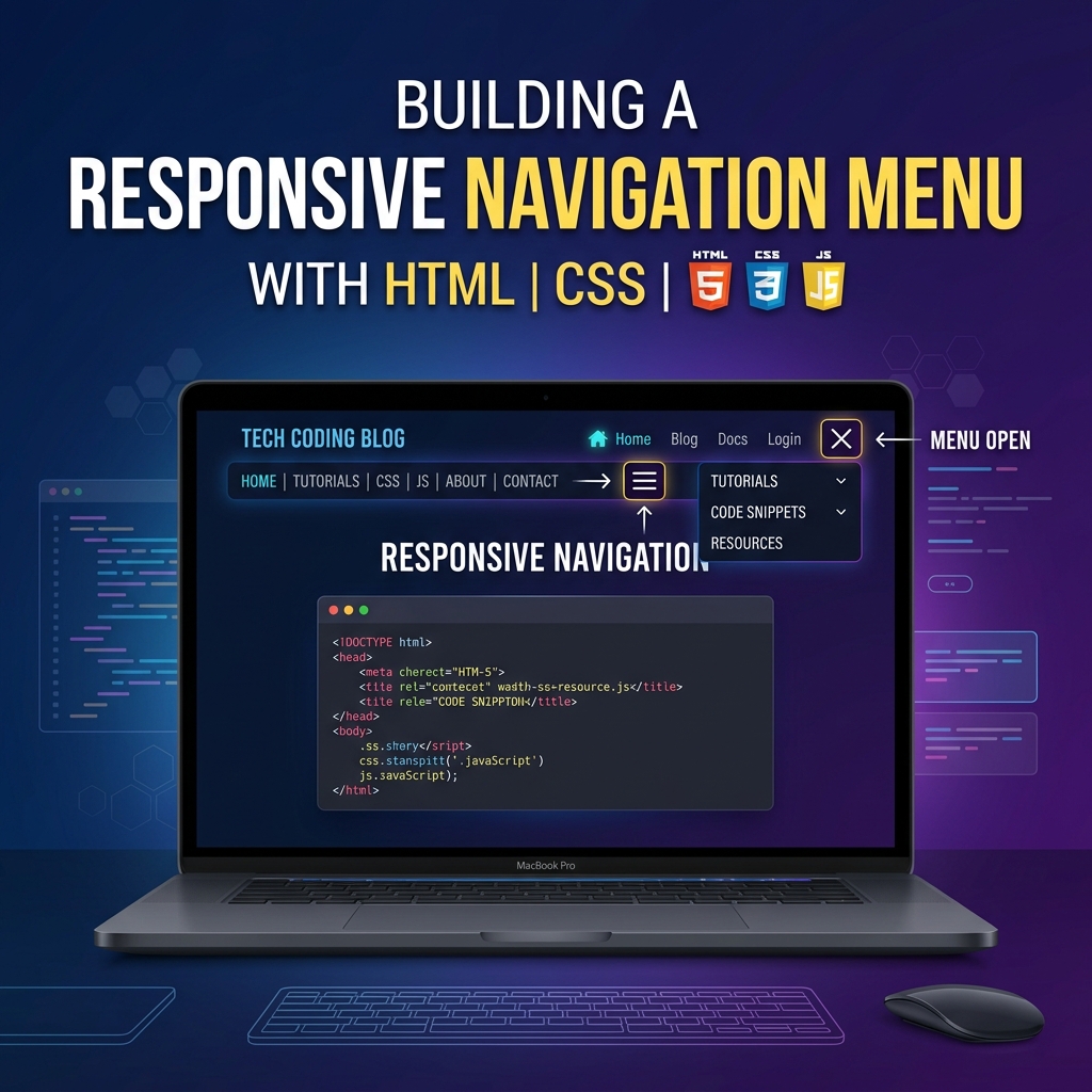
Welcome to this tutorial on Designing an Animated Dropdown Menu in CSS. Dropdown menus are an essential part of website navigation, but rigid, blocky dropdowns can ruin a premium user experience.
In this guide, we will build a modern dropdown menu with a smooth slide-and-fade animation, hover effects, and a rotating chevron icon—all using pure CSS!
1. The HTML Structure
Our navigation consists of a .nav list, containing .nav-item elements. One of these items holds our .dropdown container.
<ul class="nav">
  <li class="nav-item"><a href="#" class="nav-link">Home</a></li>

  <!-- Dropdown Trigger -->
  <li class="nav-item">
    <a href="#" class="nav-link">
      Products
      <!-- Chevron SVG -->
      <svg viewBox="0 0 20 20">...</svg>
    </a>

    <!-- The Dropdown -->
    <div class="dropdown">
      <a href="#" class="dropdown-item">
        <div class="dropdown-icon">📦</div>
        <div class="dropdown-text">
          <span>Inventory</span>
          <span class="dropdown-desc">Manage your stock</span>
        </div>
      </a>
      <!-- More items... -->
    </div>
  </li>
</ul>
2. Basic Styling & Positioning
To make the dropdown appear directly below the “Products” link, the parent .nav-item must be position: relative, and the .dropdown itself must be position: absolute.
.nav-item {
  position: relative;
  list-style: none;
}

.dropdown {
  position: absolute;
  top: 100%; /* Position directly below the trigger */
  left: 0;
  background: white;
  min-width: 240px;
  border-radius: 12px;
  box-shadow: 0 15px 35px rgba(0,0,0,0.1);
  padding: 10px;
  margin-top: 15px; /* Creates a gap between nav and dropdown */
  z-index: 10;
}
3. The CSS Animation (Slide & Fade)
This is the secret sauce. Instead of using display: none (which cannot be animated), we use opacity and visibility to hide the dropdown.
To create the animation, we start the dropdown slightly translated downwards (translateY(20px)) and slightly scaled down (scale(0.95)). When we hover over the parent .nav-item, we reset those values to normal.
/* 1. Hidden State */
.dropdown {
  opacity: 0;
  visibility: hidden;
  transform: translateY(20px) scale(0.95);
  transform-origin: top center;
  transition: all 0.3s cubic-bezier(0.16, 1, 0.3, 1);
}

/* 2. Hover State (Reveal) */
.nav-item:hover .dropdown {
  opacity: 1;
  visibility: visible;
  transform: translateY(0) scale(1);
}
Note: We use a custom cubic-bezier timing function to make the animation feel snappy and modern rather than linear and boring.
4. Polishing the Details
To make the menu look truly premium, we add two tiny details: a rotating chevron icon and a subtle hover slide effect on the dropdown items themselves.
Rotating the Chevron
We grab the SVG inside the link when the parent .nav-item is hovered, and rotate it 180 degrees.
.nav-link svg {
  transition: transform 0.3s ease;
}

.nav-item:hover .nav-link svg {
  transform: rotate(180deg);
}
Sliding the Dropdown Items
When a user hovers over an individual .dropdown-item, we push it slightly to the right using translateX.
.dropdown-item {
  transition: all 0.2s ease;
}

.dropdown-item:hover {
  background: #f8fafc;
  color: #4f46e5;
  transform: translateX(5px); /* Slide to the right */
}
By combining these simple CSS transitions, we’ve built a highly professional, smooth, and interactive navigation menu without writing a single line of JavaScript!
Check out the Live Demo to see the full code and experience the animations for yourself.
