Responsive Mega Menu Tutorial with HTML & CSS
Learn how to design a modern, full-width eCommerce mega menu using CSS Grid, HTML, and hover animations.
Table of Contents
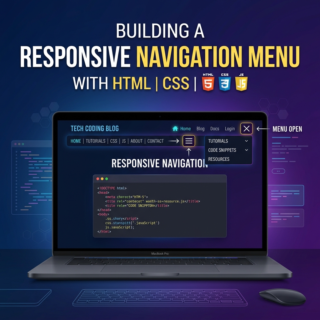
Welcome to this tutorial on Designing a Responsive Mega Menu. A mega menu is an expandable, multi-column dropdown menu commonly used on large eCommerce websites to display a massive amount of links in a clean, organized layout.
In this guide, we will build a full-width Mega Menu using CSS Grid, complete with neat link columns and a promotional banner card.
1. The HTML Layout
Unlike standard dropdowns, a Mega Menu breaks out of its parent’s width to span the entire screen.
<nav class="navbar">
  <a href="#" class="logo">StoreBrand</a>

  <ul class="nav-links">

    <!-- Mega Menu Trigger Item -->
    <li class="nav-item">
      <a href="#" class="nav-btn">Categories ▼</a>

      <!-- The Full-Width Mega Menu -->
      <div class="mega-menu">
        <div class="mega-content">

          <!-- Column 1 -->
          <div class="column">
            <h3>Electronics</h3>
            <ul class="mega-links">
              <li><a href="#">Laptops</a></li>
              <li><a href="#">Smartphones</a></li>
            </ul>
          </div>

          <!-- Column 2 (Promo) -->
          <div class="column promo-card">
            <img src="sale.jpg" alt="Promo">
            <p>Summer Sale! 50% Off</p>
            <a href="#" class="promo-btn">Shop Now</a>
          </div>

        </div>
      </div>
    </li>

  </ul>
</nav>
2. Setting up the Full-Width Dropdown
The trick to a full-width mega menu is ensuring the parent .nav-item is position: static (the default), while the .navbar container is position: relative.
This forces the absolute-positioned .mega-menu to size itself relative to the entire Navbar, rather than just the tiny list item!
.navbar {
  position: relative; /* Anchor point for the mega menu */
  display: flex;
  justify-content: space-between;
}

.nav-item {
  position: static; /* Crucial: Do NOT use relative here */
}

.mega-menu {
  position: absolute;
  top: 100%; /* Just below the navbar */
  left: 0;
  width: 100%; /* Span the full screen width */
  background: white;

  /* Animation Setup */
  opacity: 0;
  visibility: hidden;
  transform: translateY(10px);
  transition: all 0.3s ease;
}

/* Show the menu on hover */
.nav-item:hover .mega-menu {
  opacity: 1;
  visibility: visible;
  transform: translateY(0);
}
3. Organizing Content with CSS Grid
Inside the mega menu, we use CSS Grid to effortlessly split our content into 4 equal columns.
.mega-content {
  display: grid;
  grid-template-columns: repeat(4, 1fr); /* 4 equal columns */
  gap: 30px;
  padding: 40px 50px;
  max-width: 1200px;
  margin: 0 auto; /* Center the grid inside the full-width menu */
}

/* Column Headers */
.column h3 {
  font-size: 1.1rem;
  margin-bottom: 20px;
  border-bottom: 2px solid #3b82f6; /* Nice underline effect */
  padding-bottom: 10px;
}
4. Mobile Responsiveness
On mobile screens, four columns side-by-side will break the layout. We use a Media Query to change the CSS Grid to a single column, allowing users to scroll vertically through the categories instead.
@media (max-width: 900px) {
  .mega-content {
    grid-template-columns: 1fr; /* Stack columns vertically */
    padding: 20px;
  }
}
This layout gives you incredible flexibility. You can easily add icons, images, badges, or buttons inside the grid columns to create a highly engaging navigation experience. Check out the Live Demo to see the smooth CSS animations!