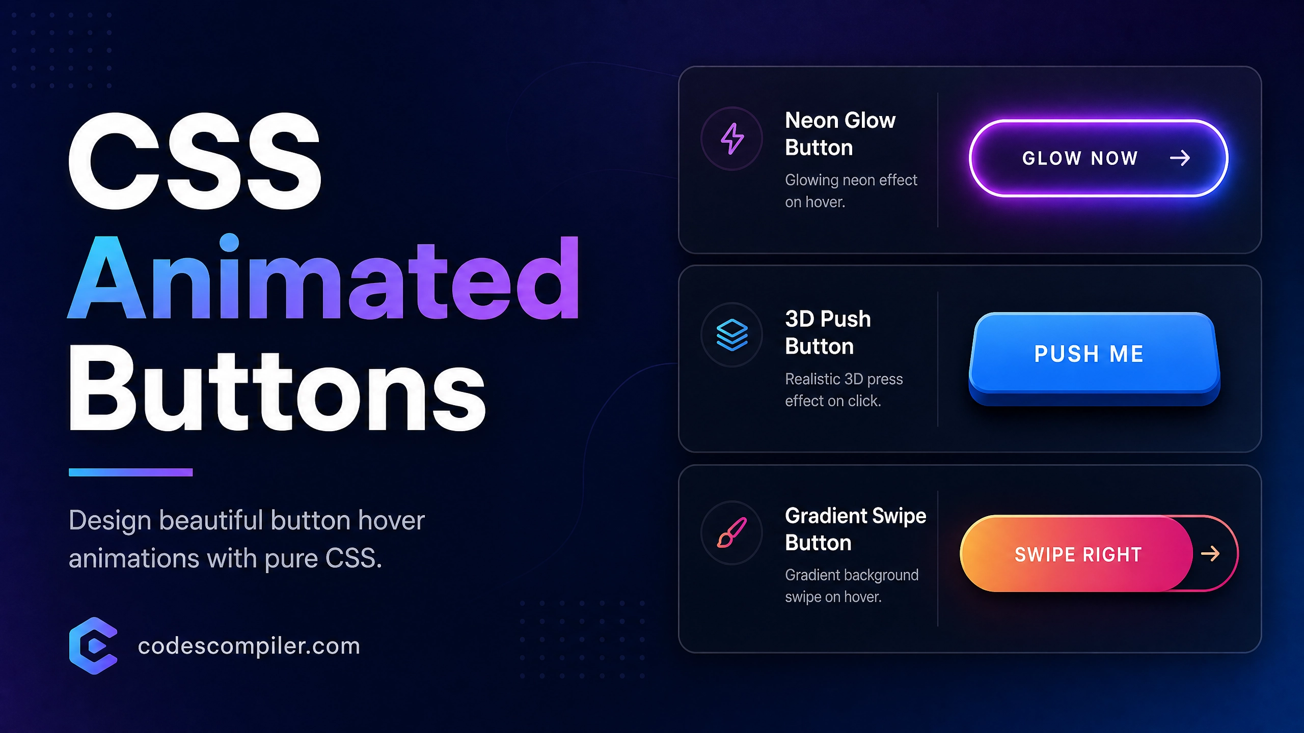
Create a Beautiful CSS Animated Buttons with HTML & CSS
Design 3 beautiful CSS button hover animations: A glowing neon button, a 3D push button, and a gradient swipe button.
Table of Contents
Buttons are the primary way users interact with your site. Adding subtle micro-interactions makes your interface feel polished and alive. Let’s create three distinct button styles using pure CSS.
1. The Glowing Neon Button
Perfect for dark themes and primary call-to-actions.
.btn-neon {
  position: relative;
  display: inline-block;
  padding: 15px 30px;
  color: #04AA6D;
  text-transform: uppercase;
  letter-spacing: 2px;
  font-size: 14px;
  font-weight: bold;
  overflow: hidden;
  transition: 0.2s;
  background: transparent;
  border: 2px solid #04AA6D;
  border-radius: 4px;
}

.btn-neon:hover {
  color: #111;
  background: #04AA6D;
  box-shadow: 0 0 10px #04AA6D, 0 0 40px #04AA6D;
}
2. The 3D Push Button
A tactile button that physically depresses when clicked.
.btn-3d {
  padding: 15px 30px;
  background-color: #3b82f6;
  color: white;
  border: none;
  border-radius: 8px;
  font-size: 16px;
  font-weight: bold;
  box-shadow: 0 6px 0 #1d4ed8;
  position: relative;
  transition: all 0.1s;
}

.btn-3d:active {
  box-shadow: 0 2px 0 #1d4ed8;
  transform: translateY(4px);
}
3. The Gradient Swipe Button
A sleek button that reveals a moving gradient on hover using background-position.
.btn-gradient {
  background-image: linear-gradient(to right, #f43f5e, #f97316, #f43f5e);
  background-size: 200%;
  color: white;
  padding: 15px 30px;
  border-radius: 30px;
  border: none;
  font-size: 16px;
  font-weight: bold;
  transition: 0.5s;
}

.btn-gradient:hover {
  background-position: right center;
  transform: translateY(-2px);
  box-shadow: 0 5px 15px rgba(244, 63, 94, 0.4);
}
Try these buttons out in the live demo!