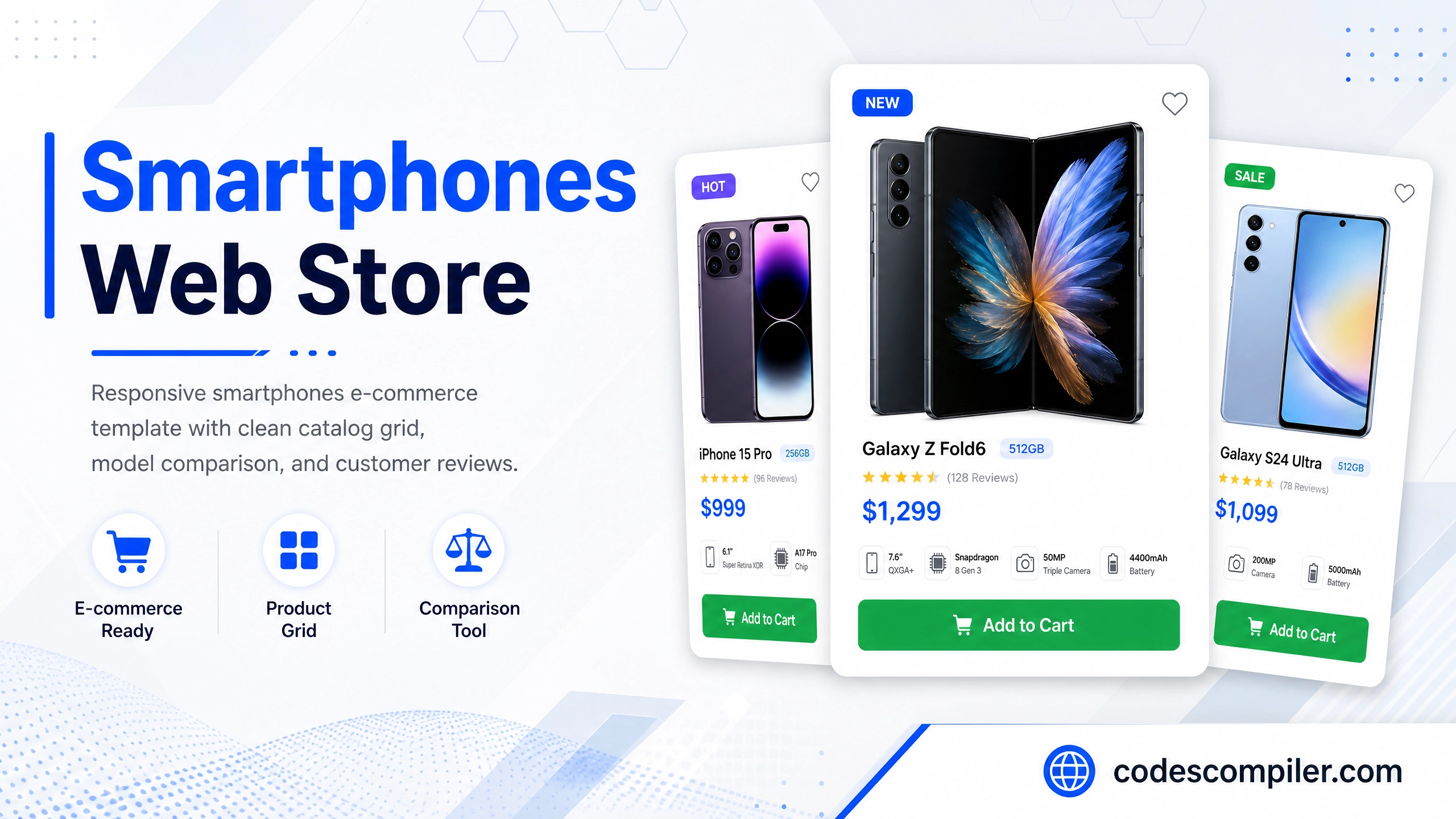
Smartphones Web Store HTML/CSS E-commerce Template
Download a responsive smartphones e-commerce website template built with HTML and vanilla CSS. Features a clean catalog grid, model comparison, and customer reviews.
Table of Contents
A modern, highly professional e-commerce landing page and catalog template tailored for mobile phone manufacturers, electronics retailers, and smart device brands. It features flagship showcase banners, detailed specifications, model comparison tables, and a rating review form.
HTML Structure
<!-- Model Comparison Section -->
<section class="comparison-section">
  <div class="comparison-table-wrapper">
    <table>
      <thead>
        <tr>
          <th>Spec Overview</th>
          <th>Nexus Ultra 5G</th>
          <th>Aero Pro</th>
        </tr>
      </thead>
      <tbody>
        <tr>
          <td class="feature-name">Display</td>
          <td>6.8" OLED 120Hz</td>
          <td>6.5" OLED 90Hz</td>
        </tr>
        <tr>
          <td class="feature-name">Processor</td>
          <td>Neural Octa-Core</td>
          <td>Apex Quad-Core</td>
        </tr>
      </tbody>
    </table>
  </div>
</section>
Customer Reviews rating form
<div class="review-form-container">
  <h3>Write a Review</h3>
  <form class="review-form">
    <input type="text" class="form-input" placeholder="Your Name" required />
    <select class="form-input" required>
      <option value="5">★★★★★ (5 Stars)</option>
      <option value="4">★★★★☆ (4 Stars)</option>
    </select>
    <textarea class="form-input" placeholder="Share your experience..." required></textarea>
    <button type="submit" class="btn-blue">Submit Review</button>
  </form>
</div>
CSS Styling
Here are the key styling definitions for MobiStore comparison features:
.comparison-table-wrapper {
  overflow-x: auto;
  background: #fff;
  border: 1px solid #e2e8f0;
  border-radius: 12px;
}
table {
  width: 100%;
  border-collapse: collapse;
}
th, td {
  padding: 18px 24px;
  border-bottom: 1px solid #e2e8f0;
}
.review-form {
  display: flex;
  flex-direction: column;
  gap: 16px;
}
Responsive Layout
Standard media query definitions ensure the hero columns wrap correctly and align centered on smaller smartphone viewports:
@media (max-width: 768px) {
  header { padding: 20px 24px; }
  .reviews-layout { grid-template-columns: 1fr; }
}