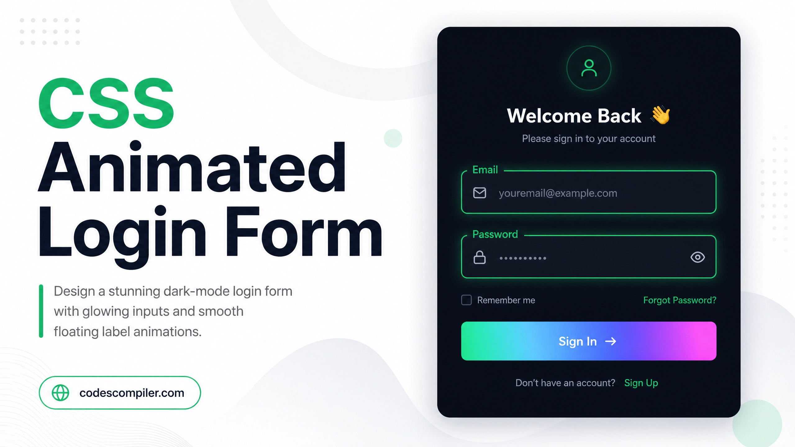
Build a CSS Animated Login Form Design (Source Code)
Design a stunning dark-mode login form with glowing input fields, smooth label animation, and a gradient submit button — pure HTML and CSS.
Table of Contents
Login forms don’t have to be boring. In this tutorial we’ll build a visually striking dark-mode login form with floating labels and glowing inputs — using only HTML and CSS.
The Floating Label Effect
The key technique is using CSS transform to move the label upward when the input is focused:
.input-group {
  position: relative;
  margin-bottom: 24px;
}

.input-group input {
  width: 100%;
  padding: 14px 16px;
  background: rgba(255,255,255,0.05);
  border: 1px solid rgba(255,255,255,0.15);
  border-radius: 10px;
  color: #fff;
  font-size: 15px;
  outline: none;
  transition: border-color .3s, box-shadow .3s;
}

.input-group input:focus {
  border-color: #04AA6D;
  box-shadow: 0 0 0 3px rgba(4, 170, 109, 0.2);
}

.input-group label {
  position: absolute;
  left: 16px;
  top: 14px;
  color: rgba(255,255,255,0.4);
  font-size: 15px;
  pointer-events: none;
  transition: all .25s ease;
}

.input-group input:focus + label,
.input-group input:not(:placeholder-shown) + label {
  top: -10px;
  font-size: 11px;
  color: #04AA6D;
  background: #1a1a2e;
  padding: 0 6px;
  border-radius: 4px;
}
Complete Login Form
<!DOCTYPE html>
<html lang="en">
<head>
  <meta charset="UTF-8">
  <title>Animated Login Form</title>
  <style>
    * { box-sizing: border-box; margin: 0; padding: 0; }
    body {
      min-height: 100vh;
      display: flex;
      align-items: center;
      justify-content: center;
      background: #0f0f1a;
      font-family: 'Segoe UI', sans-serif;
    }
    .card {
      background: #1a1a2e;
      border: 1px solid rgba(255,255,255,0.1);
      border-radius: 20px;
      padding: 40px;
      width: 360px;
      box-shadow: 0 20px 60px rgba(0,0,0,0.5);
    }
    h2 { color: #fff; font-size: 26px; margin-bottom: 8px; }
    p  { color: rgba(255,255,255,0.4); font-size: 14px; margin-bottom: 32px; }

    .input-group { position: relative; margin-bottom: 24px; }
    .input-group input {
      width: 100%;
      padding: 14px 16px;
      background: rgba(255,255,255,0.05);
      border: 1px solid rgba(255,255,255,0.15);
      border-radius: 10px;
      color: #fff;
      font-size: 15px;
      outline: none;
      transition: border-color .3s, box-shadow .3s;
    }
    .input-group input:focus {
      border-color: #04AA6D;
      box-shadow: 0 0 0 3px rgba(4,170,109,0.2);
    }
    .input-group label {
      position: absolute;
      left: 16px;
      top: 14px;
      color: rgba(255,255,255,0.4);
      font-size: 15px;
      pointer-events: none;
      transition: all .25s ease;
    }
    .input-group input:focus + label,
    .input-group input:not(:placeholder-shown) + label {
      top: -10px;
      font-size: 11px;
      color: #04AA6D;
      background: #1a1a2e;
      padding: 0 6px;
    }
    .btn {
      width: 100%;
      padding: 14px;
      background: linear-gradient(135deg, #04AA6D, #038a58);
      border: none;
      border-radius: 10px;
      color: #fff;
      font-size: 16px;
      font-weight: 700;
      cursor: pointer;
      transition: opacity .2s, transform .2s;
    }
    .btn:hover { opacity: 0.9; transform: translateY(-1px); }
  </style>
</head>
<body>
  <div class="card">
    <h2>Welcome Back 👋</h2>
    <p>Sign in to your account</p>
    <form>
      <div class="input-group">
        <input type="email" id="email" placeholder=" " required>
        <label for="email">Email Address</label>
      </div>
      <div class="input-group">
        <input type="password" id="pass" placeholder=" " required>
        <label for="pass">Password</label>
      </div>
      <button type="submit" class="btn">Sign In →</button>
    </form>
  </div>
</body>
</html>
Notice: The label animation requires
placeholder=" "(a space) on the input. This allows the:not(:placeholder-shown)CSS selector to work correctly when the field has content.