Build a CSS Dark Mode Toggle Switch (Source Code)
Implement a smooth dark/light mode toggle using CSS custom properties and JavaScript. Save the user's preference with localStorage.
Table of Contents
Dark mode has become an expected feature on modern websites. In this tutorial, you’ll implement a polished animated toggle switch that remembers the user’s preference across page loads using localStorage.
CSS Custom Properties (Variables)
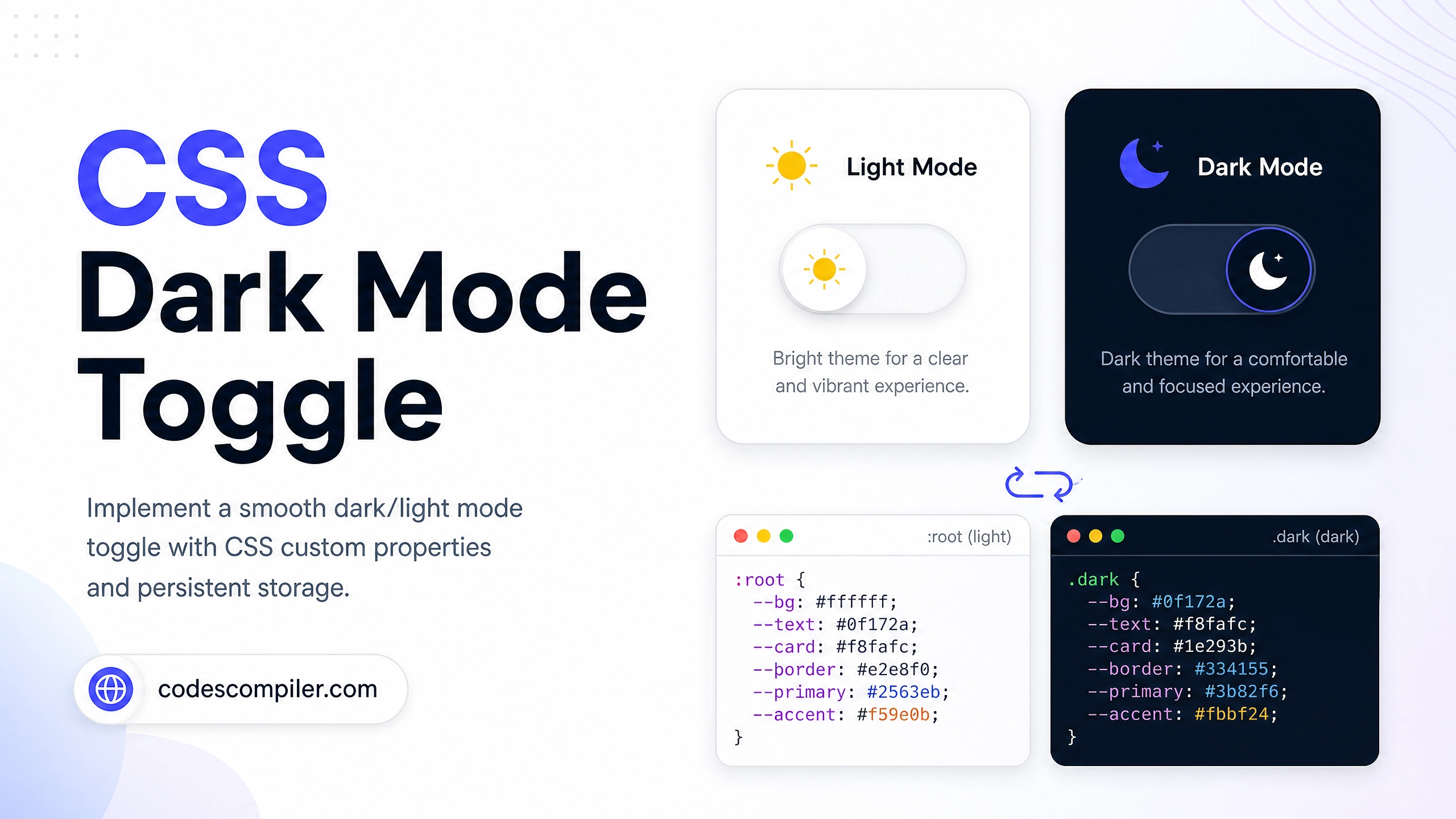
The key to easy dark mode is using CSS variables on the :root that get overridden on [data-theme="dark"]:
:root {
  --bg:        #ffffff;
  --surface:   #f9fafb;
  --text:      #111827;
  --text-muted:#6b7280;
  --border:    #e5e7eb;
  --primary:   #04AA6D;
  --shadow:    rgba(0, 0, 0, 0.08);
}

[data-theme="dark"] {
  --bg:        #0f172a;
  --surface:   #1e293b;
  --text:      #f1f5f9;
  --text-muted:#94a3b8;
  --border:    rgba(255, 255, 255, 0.08);
  --primary:   #34d399;
  --shadow:    rgba(0, 0, 0, 0.4);
}

/* All elements use variables instead of hardcoded colors */
body {
  background: var(--bg);
  color: var(--text);
  transition: background 0.3s ease, color 0.3s ease;
}
The Toggle Switch HTML
<label class="toggle-switch" for="themeToggle" aria-label="Toggle dark mode">
  <input type="checkbox" id="themeToggle" />
  <div class="toggle-track">
    <span class="toggle-icon light">☀️</span>
    <span class="toggle-icon dark">🌙</span>
    <div class="toggle-thumb"></div>
  </div>
</label>
Toggle Switch CSS
.toggle-switch { cursor: pointer; display: inline-flex; align-items: center; }
.toggle-switch input { display: none; }

.toggle-track {
  width: 64px;
  height: 32px;
  background: #e5e7eb;
  border-radius: 32px;
  position: relative;
  transition: background .3s;
  display: flex;
  align-items: center;
  padding: 4px;
}
.toggle-switch input:checked + .toggle-track {
  background: #1e293b;
}

.toggle-thumb {
  width: 24px;
  height: 24px;
  border-radius: 50%;
  background: #fff;
  box-shadow: 0 2px 6px rgba(0,0,0,0.2);
  position: absolute;
  left: 4px;
  transition: transform .3s cubic-bezier(0.34, 1.56, 0.64, 1);
}
.toggle-switch input:checked + .toggle-track .toggle-thumb {
  transform: translateX(32px);
}

.toggle-icon {
  position: absolute;
  font-size: 14px;
  transition: opacity .2s;
}
.toggle-icon.light { left: 6px; }
.toggle-icon.dark  { right: 6px; }

/* Show correct icon based on state */
.toggle-icon.dark   { opacity: 0; }
input:checked + .toggle-track .toggle-icon.light { opacity: 0; }
input:checked + .toggle-track .toggle-icon.dark  { opacity: 1; }
JavaScript — Toggle + Persist
const toggle = document.getElementById('themeToggle');
const root   = document.documentElement;

// Apply saved preference on load
const saved = localStorage.getItem('theme') || 'light';
root.setAttribute('data-theme', saved);
toggle.checked = saved === 'dark';

// Listen for toggle change
toggle.addEventListener('change', () => {
  const theme = toggle.checked ? 'dark' : 'light';
  root.setAttribute('data-theme', theme);
  localStorage.setItem('theme', theme);
});
Respecting System Preference
// On first visit (no saved preference), use the OS setting
if (!localStorage.getItem('theme')) {
  const prefersDark = window.matchMedia('(prefers-color-scheme: dark)').matches;
  const theme = prefersDark ? 'dark' : 'light';
  root.setAttribute('data-theme', theme);
  toggle.checked = prefersDark;
}

// Also react to live OS theme changes
window.matchMedia('(prefers-color-scheme: dark)').addEventListener('change', e => {
  if (!localStorage.getItem('theme')) {
    root.setAttribute('data-theme', e.matches ? 'dark' : 'light');
    toggle.checked = e.matches;
  }
});
Best Practice: Always check
prefers-color-schemeas the default — it respects the user’s OS setting before they’ve ever interacted with your site.