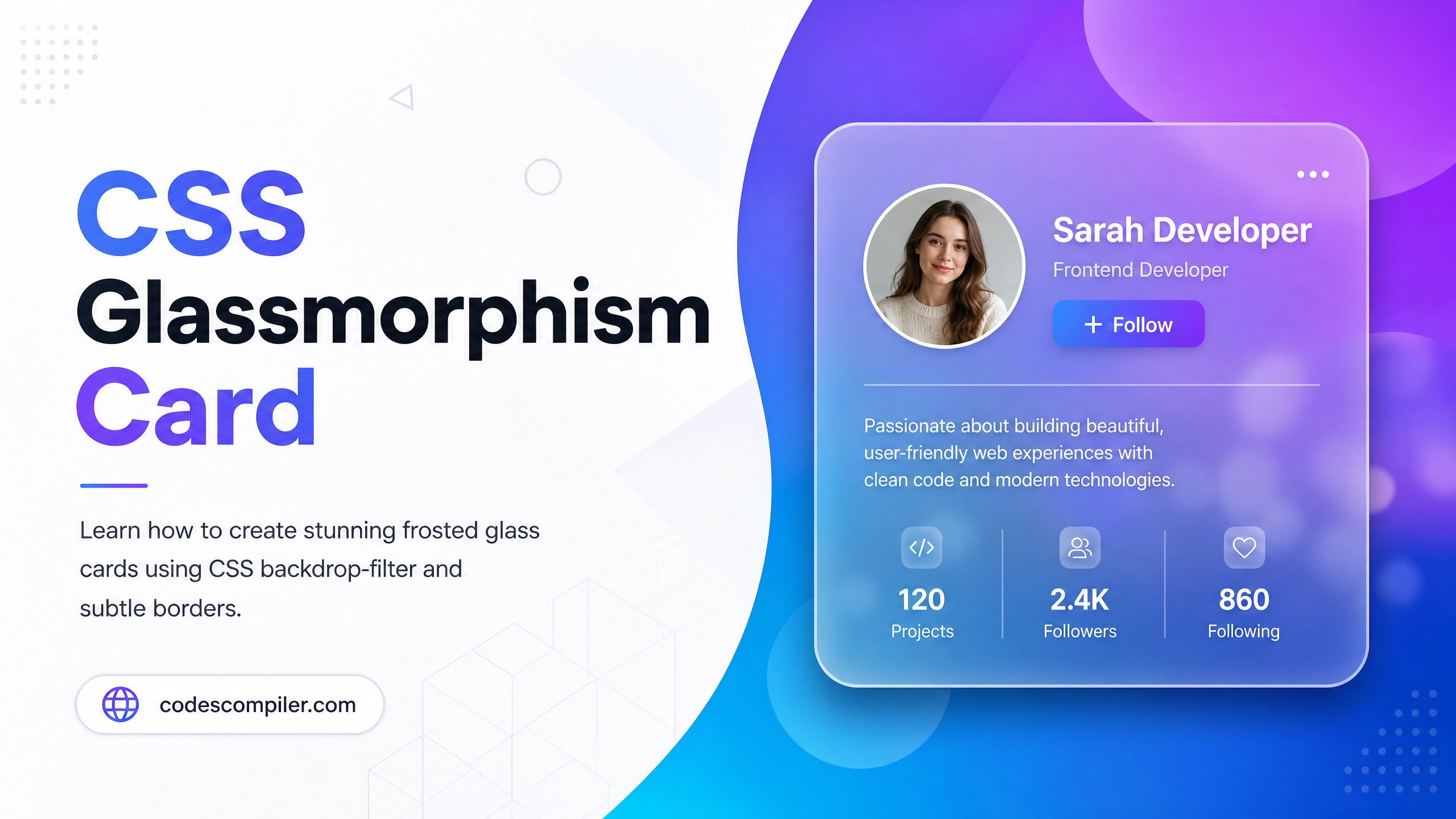
Build a CSS Glassmorphism Card Design (Source Code)
Learn how to create stunning frosted glass cards using CSS backdrop-filter, rgba backgrounds, and subtle borders. Pure CSS, no libraries.
Table of Contents
Glassmorphism is one of the hottest UI trends — frosted glass panels that sit over colorful backgrounds. In this guide, you’ll master the technique using only CSS.
The Core CSS Properties
.glass-card {
  /* 1. Semi-transparent white background */
  background: rgba(255, 255, 255, 0.15);

  /* 2. The magic — blur the content behind the card */
  backdrop-filter: blur(12px);
  -webkit-backdrop-filter: blur(12px);

  /* 3. Subtle border for the glass edge effect */
  border: 1px solid rgba(255, 255, 255, 0.3);

  /* 4. Rounded corners + soft shadow */
  border-radius: 20px;
  box-shadow: 0 8px 32px rgba(0, 0, 0, 0.2);
}
Full Example
<!DOCTYPE html>
<html lang="en">
<head>
<meta charset="UTF-8">
<title>Glassmorphism Card</title>
<style>
body {
min-height: 100vh;
display: flex;
align-items: center;
justify-content: center;
background: linear-gradient(135deg, #667eea, #764ba2);
}
.glass-card {
background: rgba(255, 255, 255, 0.15);
backdrop-filter: blur(12px);
-webkit-backdrop-filter: blur(12px);
border: 1px solid rgba(255, 255, 255, 0.3);
border-radius: 20px;
box-shadow: 0 8px 32px rgba(0, 0, 0, 0.2);
padding: 40px;
width: 320px;
color: #fff;
text-align: center;
}
.glass-card h2 { font-size: 24px; margin-bottom: 12px; }
.glass-card p { font-size: 14px; opacity: 0.8; line-height: 1.6; }
.glass-card .avatar {
width: 80px;
height: 80px;
border-radius: 50%;
background: rgba(255,255,255,0.3);
display: flex;
align-items: center;
justify-content: center;
font-size: 36px;
margin: 0 auto 16px;
border: 2px solid rgba(255,255,255,0.5);
}
.btn {
margin-top: 20px;
padding: 10px 28px;
background: rgba(255,255,255,0.25);
border: 1px solid rgba(255,255,255,0.5);
border-radius: 50px;
color: #fff;
cursor: pointer;
font-weight: 600;
transition: background .2s;
}
.btn:hover { background: rgba(255,255,255,0.4); }
</style>
</head>
<body>
<div class="glass-card">
<div class="avatar">👩💻</div>
<h2>Sarah Developer</h2>
<p>Front-end engineer passionate about creating beautiful, accessible web experiences.</p>
<button class="btn">Follow</button>
</div>
</body>
</html>
Browser Support
backdrop-filter is supported in all modern browsers. For older ones, add a fallback:
@supports not (backdrop-filter: blur(1px)) {
  .glass-card {
    background: rgba(255, 255, 255, 0.5); /* solid fallback */
  }
}
Design Tip: Glassmorphism works best over vivid gradient or image backgrounds. On white, the effect is invisible!