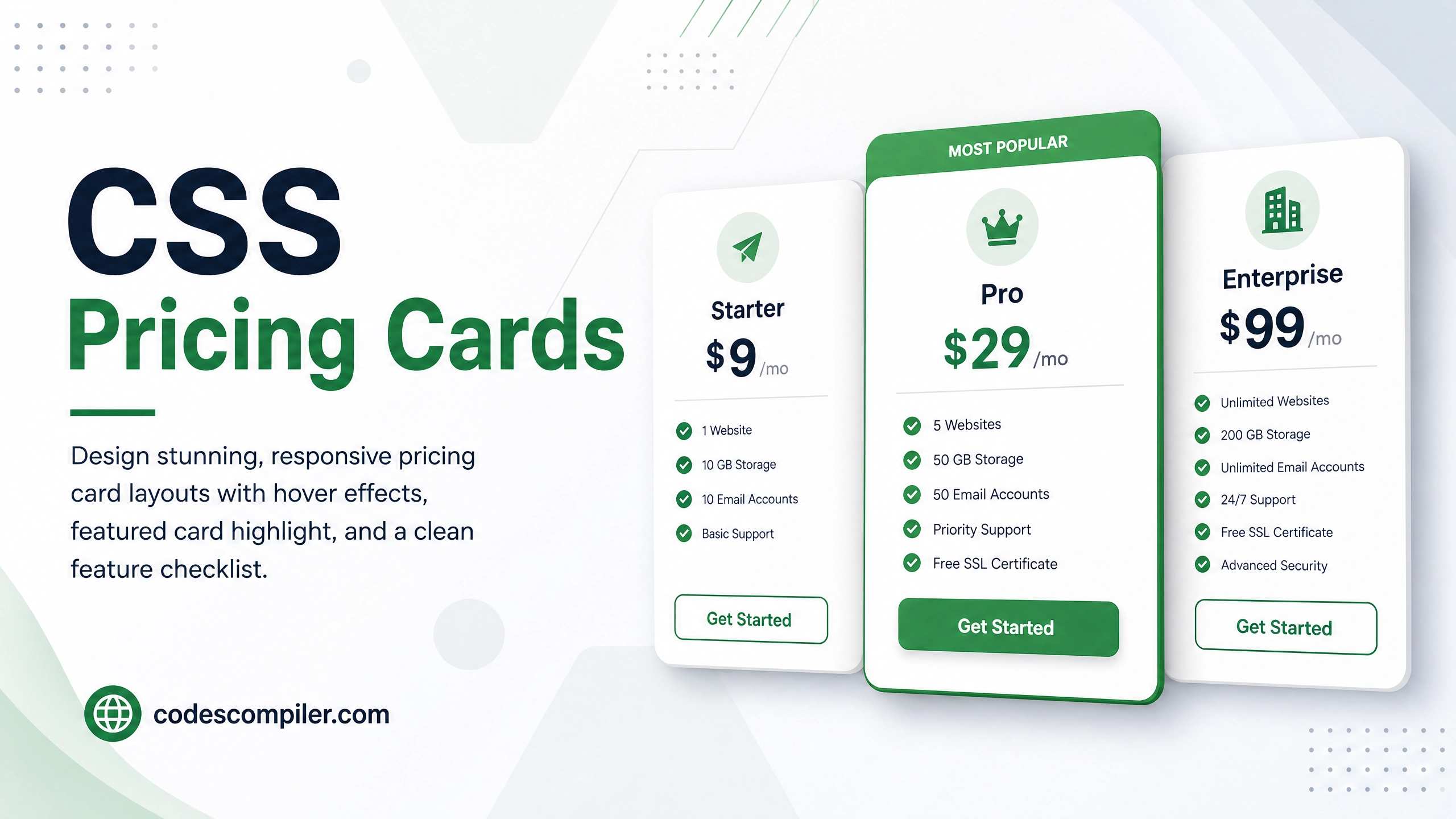
Create a Beautiful CSS Pricing Cards Design with HTML & CSS
Design stunning, responsive pricing card layouts with hover effects, featured card highlight, and a clean feature checklist — pure HTML & CSS.
Table of Contents
Pricing cards are a crucial UI component for SaaS products and landing pages. In this tutorial we’ll build three pricing tiers with a highlighted “Pro” card, hover animations, and full responsiveness.
The Card Structure
<div class="pricing-grid">
  <!-- Basic -->
  <div class="pricing-card">
    <div class="card-badge">Starter</div>
    <div class="price"><span class="currency">$</span>9<span class="period">/mo</span></div>
    <p class="card-desc">Perfect for individuals getting started.</p>
    <ul class="features">
      <li class="check">5 Projects</li>
      <li class="check">10 GB Storage</li>
      <li class="check">Basic Analytics</li>
      <li class="cross">Priority Support</li>
      <li class="cross">Custom Domain</li>
    </ul>
    <a href="#" class="card-btn">Get Started</a>
  </div>

  <!-- Pro (Featured) -->
  <div class="pricing-card featured">
    <div class="popular-tag">Most Popular</div>
    <div class="card-badge">Pro</div>
    <div class="price"><span class="currency">$</span>29<span class="period">/mo</span></div>
    <!-- ... -->
  </div>

  <!-- Enterprise -->
  <div class="pricing-card">...</div>
</div>
The CSS Magic
.pricing-grid {
  display: grid;
  grid-template-columns: repeat(auto-fit, minmax(260px, 1fr));
  gap: 28px;
  align-items: stretch;
}

.pricing-card {
  background: #fff;
  border: 2px solid #e5e7eb;
  border-radius: 24px;
  padding: 36px 30px;
  display: flex;
  flex-direction: column;
  position: relative;
  transition: transform .3s, box-shadow .3s, border-color .3s;
}
.pricing-card:hover {
  transform: translateY(-8px);
  box-shadow: 0 20px 50px rgba(0,0,0,0.1);
  border-color: #04AA6D;
}

/* Featured (Pro) card gets special treatment */
.pricing-card.featured {
  background: linear-gradient(160deg, #282A35 0%, #1a1b26 100%);
  border-color: #04AA6D;
  color: #fff;
  transform: scale(1.04);
  box-shadow: 0 20px 60px rgba(4,170,109,0.25);
}
.pricing-card.featured:hover {
  transform: scale(1.04) translateY(-8px);
}

/* Price display */
.price {
  font-size: 52px;
  font-weight: 900;
  line-height: 1;
  margin: 20px 0 10px;
}
.currency { font-size: 24px; vertical-align: top; margin-top: 10px; display: inline-block; }
.period   { font-size: 16px; font-weight: 500; opacity: 0.6; }

/* Feature list checkmarks */
.features li { padding: 8px 0; font-size: 14px; display: flex; align-items: center; gap: 10px; }
.features li.check::before { content: '✓'; color: #04AA6D; font-weight: 900; font-size: 16px; }
.features li.cross { opacity: 0.4; }
.features li.cross::before { content: '✕'; color: #ef4444; font-weight: 700; }
The CTA Button
.card-btn {
  display: block;
  text-align: center;
  padding: 14px;
  border-radius: 12px;
  font-weight: 800;
  font-size: 15px;
  text-decoration: none;
  margin-top: auto;
  transition: all .2s;
}

/* Default button */
.pricing-card:not(.featured) .card-btn {
  background: #f3f4f6;
  color: #374151;
  border: 2px solid #e5e7eb;
}
.pricing-card:not(.featured) .card-btn:hover {
  background: #04AA6D;
  color: #fff;
  border-color: #04AA6D;
}

/* Featured card button */
.pricing-card.featured .card-btn {
  background: #04AA6D;
  color: #fff;
  box-shadow: 0 6px 20px rgba(4,170,109,0.4);
}
.pricing-card.featured .card-btn:hover {
  background: #038a58;
  transform: translateY(-2px);
}
Design Tip: Always visually elevate your recommended plan — it guides users toward your best offer!