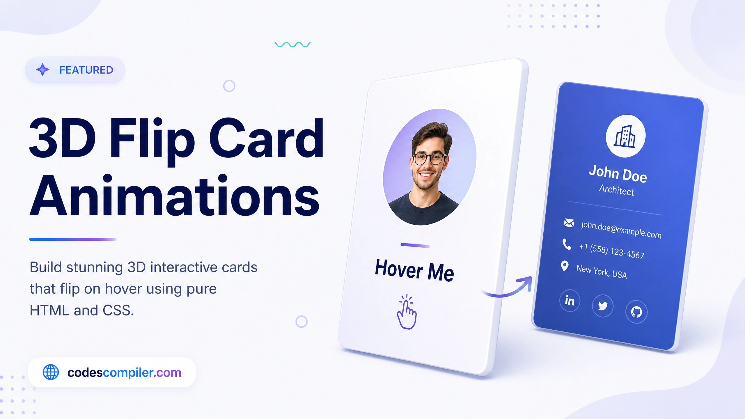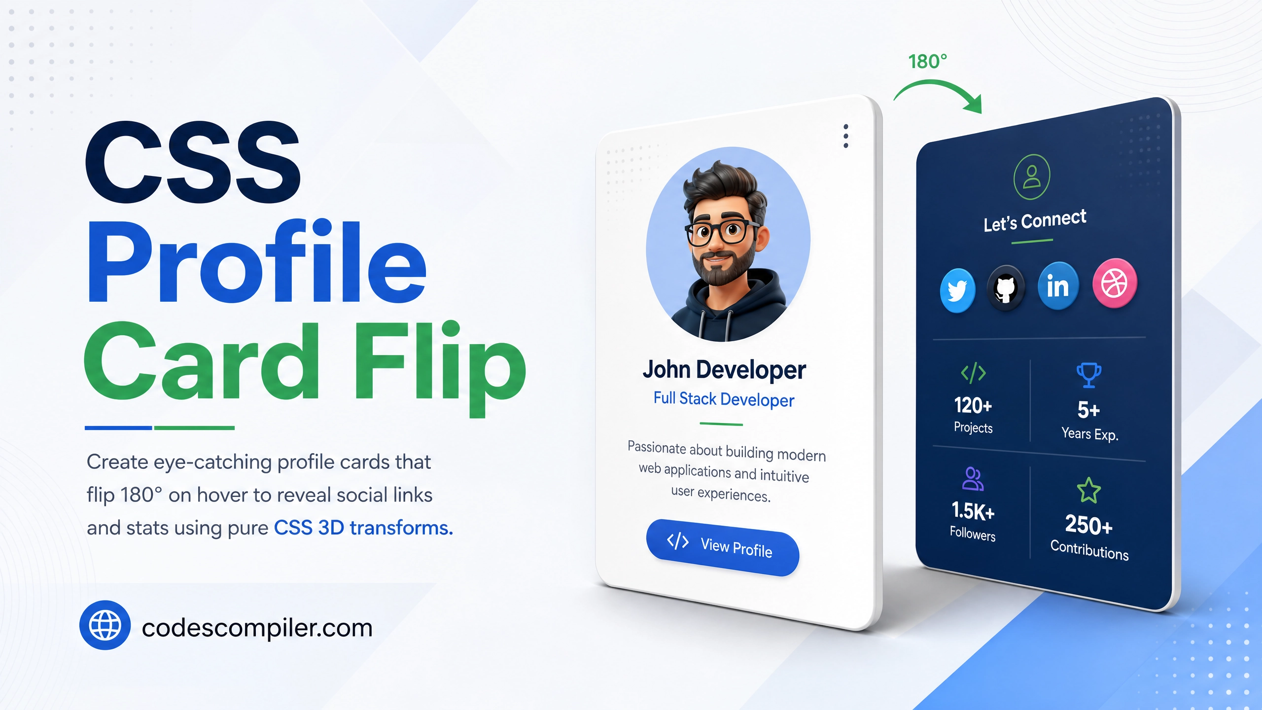
CSS Animated Profile Card with 3D Flip Effect
Create eye-catching profile cards that flip 180° on hover to reveal social links and stats — using pure CSS 3D transforms. No JavaScript needed.
Table of Contents
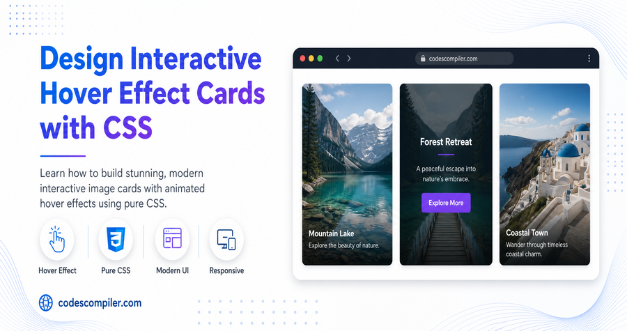
The CSS 3D flip card is one of the most impressive effects you can create with just CSS — no JavaScript. On hover, the card smoothly rotates 180° to reveal a hidden back face with additional info.
The Key CSS Concept
The flip uses transform-style: preserve-3d and perspective on the parent so both card faces exist in the same 3D space:
/* PARENT sets up the 3D stage */
.card {
  perspective: 800px;    /* depth of field */
  width: 280px;
  height: 360px;
}

/* INNER rotates — contains both faces */
.card-inner {
  width: 100%;
  height: 100%;
  position: relative;
  transform-style: preserve-3d;
  transition: transform 0.7s cubic-bezier(0.4, 0, 0.2, 1);
}

/* Flip on hover */
.card:hover .card-inner {
  transform: rotateY(180deg);
}

/* Both faces need this to hide when facing away */
.card-front,
.card-back {
  position: absolute;
  inset: 0;
  border-radius: 24px;
  backface-visibility: hidden;   /* KEY: hides the reverse side */
}

/* Back face starts at -180deg so it faces away */
.card-back {
  transform: rotateY(180deg);
}
Full HTML
<div class="card">
<div class="card-inner">
<!-- Front Face -->
<div class="card-front">
<div class="avatar-ring">
<div class="avatar">👩💻</div>
</div>
<h2 class="name">Sarah Chen</h2>
<p class="role">Frontend Developer</p>
<div class="tags">
<span>React</span><span>CSS</span><span>TypeScript</span>
</div>
<p class="hint">Hover to see more →</p>
</div>
<!-- Back Face -->
<div class="card-back">
<h3>Connect With Me</h3>
<div class="stats-row">
<div class="stat"><div class="n">142</div><div class="l">Projects</div></div>
<div class="stat"><div class="n">8.4k</div><div class="l">Followers</div></div>
<div class="stat"><div class="n">96%</div><div class="l">Rating</div></div>
</div>
<div class="social-links">
<a href="#">GitHub</a>
<a href="#">LinkedIn</a>
<a href="#">Twitter</a>
</div>
<a href="#" class="hire-btn">Hire Me →</a>
</div>
</div>
</div>
Styling Both Faces
.card-front {
  background: linear-gradient(160deg, #1a1b26, #282A35);
  color: #fff;
  display: flex;
  flex-direction: column;
  align-items: center;
  justify-content: center;
  gap: 12px;
  padding: 32px 24px;
}

.card-back {
  background: linear-gradient(160deg, #04AA6D, #038a58);
  color: #fff;
  transform: rotateY(180deg);
  display: flex;
  flex-direction: column;
  align-items: center;
  justify-content: center;
  gap: 16px;
  padding: 28px;
}

.avatar-ring {
  width: 90px; height: 90px;
  border-radius: 50%;
  background: rgba(255,255,255,0.1);
  display: flex;
  align-items: center;
  justify-content: center;
  border: 3px solid rgba(255,255,255,0.3);
  font-size: 44px;
}

.hire-btn {
  padding: 11px 28px;
  background: rgba(255,255,255,0.2);
  border: 2px solid rgba(255,255,255,0.6);
  border-radius: 30px;
  color: #fff;
  font-weight: 800;
  text-decoration: none;
  transition: background .2s;
}
.hire-btn:hover { background: rgba(255,255,255,0.35); }
Touch Devices: For mobile, add a
.flippedclass toggled on tap instead of relying on:hover.