CSS Preloaders & Spinners - Complete Step-by-Step Tutorial
Implement 3 beautiful glowing loading animations on a dark background (circle spinner, bouncing dots, pulse).
Table of Contents
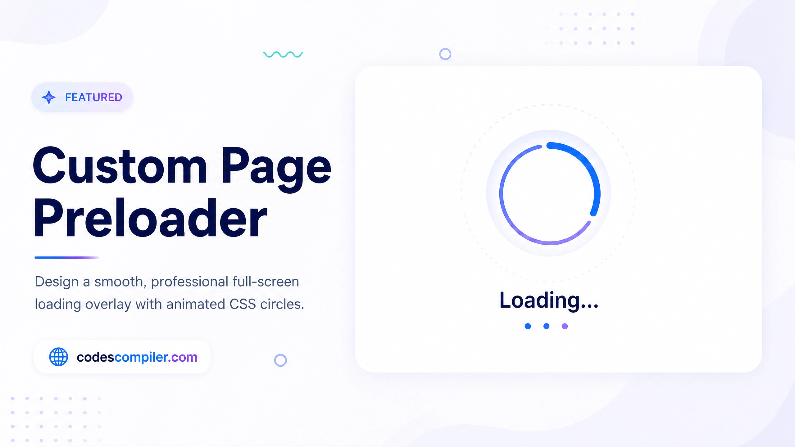
Keeping users engaged while data loads is critical. A beautiful CSS preloader makes wait times feel shorter. Let’s create three distinct loaders without any SVGs or JavaScript.
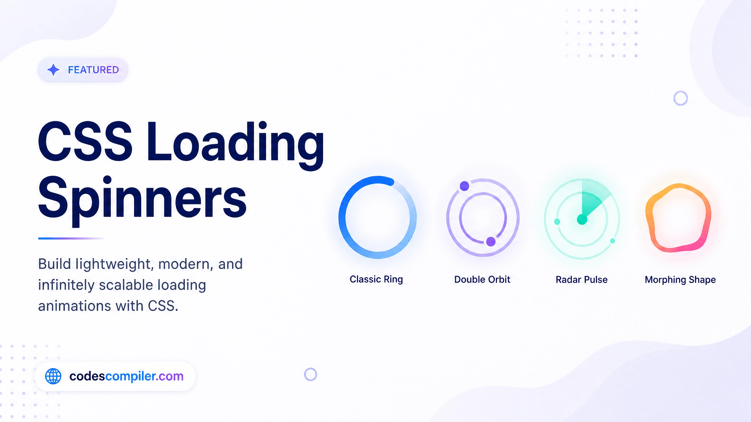
1. Dual Ring Spinner
.spinner {
  width: 48px;
  height: 48px;
  border: 4px solid rgba(4, 170, 109, 0.2);
  border-left-color: #04AA6D;
  border-radius: 50%;
  animation: spin 1s linear infinite;
}

@keyframes spin {
  to { transform: rotate(360deg); }
}
2. Bouncing Dots
.bouncing-dots {
  display: flex;
  justify-content: center;
  gap: 8px;
}

.bouncing-dots div {
  width: 12px;
  height: 12px;
  background: #3b82f6;
  border-radius: 50%;
  animation: bounce 0.6s infinite alternate;
}

.bouncing-dots div:nth-child(2) { animation-delay: 0.2s; }
.bouncing-dots div:nth-child(3) { animation-delay: 0.4s; }

@keyframes bounce {
  to {
    transform: translateY(-16px);
    opacity: 0.5;
  }
}
3. Pulse Ring
.pulse {
  width: 48px;
  height: 48px;
  background: #8b5cf6;
  border-radius: 50%;
  animation: pulse-ring 1.2s cubic-bezier(0.25, 0.8, 0.25, 1) infinite;
}

@keyframes pulse-ring {
  0% { transform: scale(0.5); opacity: 1; }
  100% { transform: scale(1.5); opacity: 0; }
}
Add these to your next project for an instant UX upgrade!