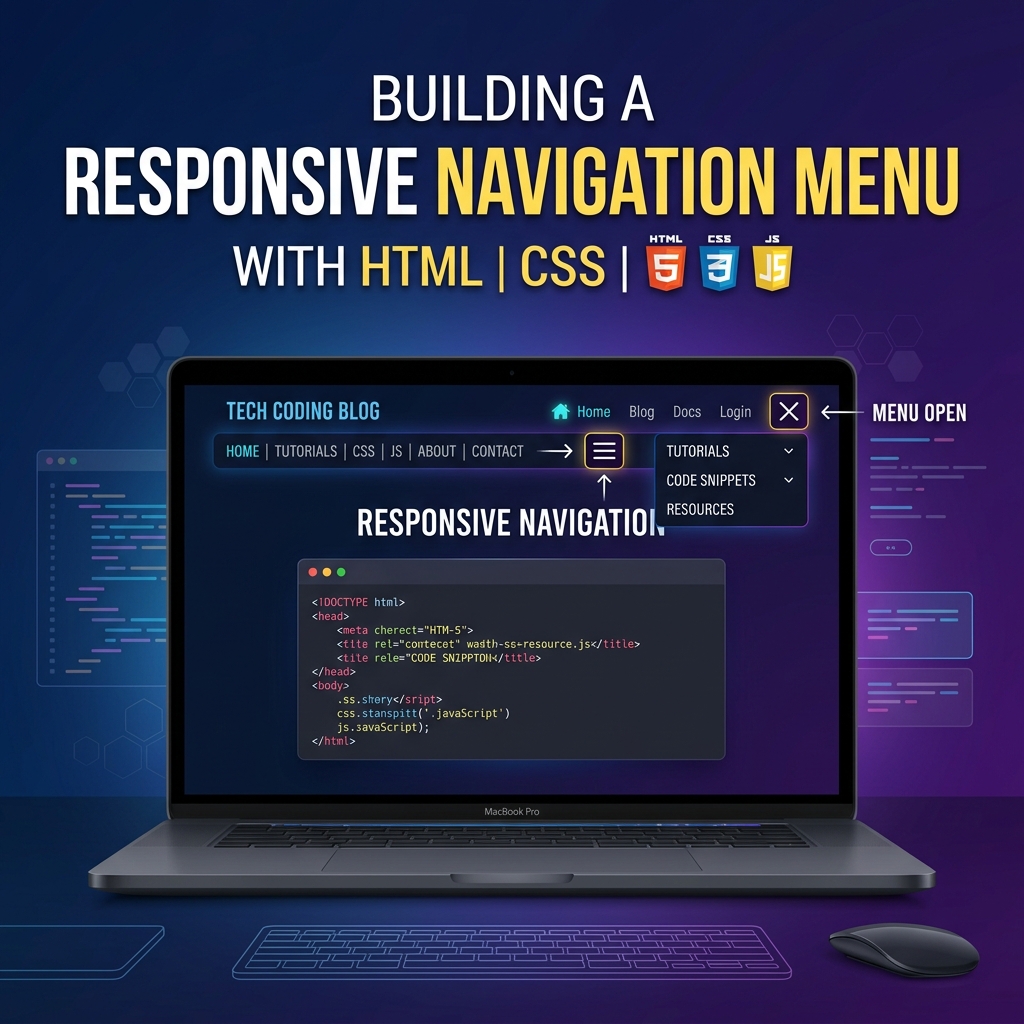
Responsive Navigation Menu with HTML, CSS & JavaScript
Build a fully responsive hamburger navigation menu from scratch. Includes smooth slide animation, active link highlight, and mobile-first design.
Table of Contents
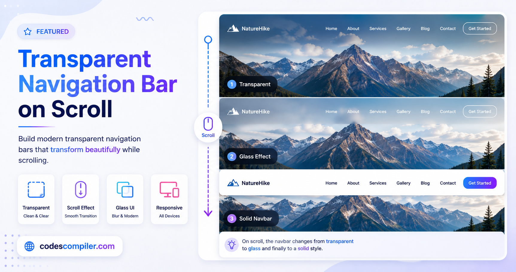
A responsive navigation bar is one of the most essential components in any modern website. In this tutorial, we’ll build a smooth hamburger navigation menu that collapses on mobile and expands on desktop — all with vanilla HTML, CSS, and JavaScript.
Final Result
- ✅ Desktop: full horizontal nav links
- ✅ Mobile: hamburger icon → sliding sidebar menu
- ✅ Smooth CSS transitions
- ✅ Active page highlight
- ✅ Click outside to close
HTML
<header class="navbar">
  <a href="/" class="logo">MySite</a>
  <nav class="nav-links" id="navLinks">
    <a href="/" class="active">Home</a>
    <a href="/about">About</a>
    <a href="/blog">Blog</a>
    <a href="/contact">Contact</a>
  </nav>
  <button class="hamburger" id="hamburger" aria-label="Menu">
    <span></span><span></span><span></span>
  </button>
</header>
CSS
.navbar {
  display: flex;
  align-items: center;
  justify-content: space-between;
  padding: 0 24px;
  height: 60px;
  background: #1a1a2e;
  position: sticky;
  top: 0;
  z-index: 100;
}

.logo { color: #04AA6D; font-weight: 800; font-size: 20px; text-decoration: none; }

.nav-links a {
  color: #ccc;
  text-decoration: none;
  margin-left: 24px;
  font-size: 15px;
  transition: color .2s;
}
.nav-links a:hover, .nav-links a.active { color: #04AA6D; }

.hamburger {
  display: none;
  flex-direction: column;
  gap: 5px;
  background: none;
  border: none;
  cursor: pointer;
  padding: 4px;
}
.hamburger span {
  display: block;
  width: 24px;
  height: 2px;
  background: #fff;
  transition: all .3s;
}

@media (max-width: 768px) {
  .hamburger { display: flex; }
  .nav-links {
    position: fixed;
    top: 60px;
    right: -100%;
    width: 240px;
    height: calc(100vh - 60px);
    background: #1a1a2e;
    flex-direction: column;
    padding: 24px;
    transition: right .3s ease;
  }
  .nav-links.open { right: 0; }
  .nav-links a { margin: 10px 0; font-size: 16px; }
}
JavaScript
const hamburger = document.getElementById('hamburger');
const navLinks  = document.getElementById('navLinks');

hamburger.addEventListener('click', () => {
  navLinks.classList.toggle('open');
});

// Close when clicking outside
document.addEventListener('click', (e) => {
  if (!hamburger.contains(e.target) && !navLinks.contains(e.target)) {
    navLinks.classList.remove('open');
  }
});
Tip: Add
aria-expandedattribute updates to the hamburger button for better accessibility!