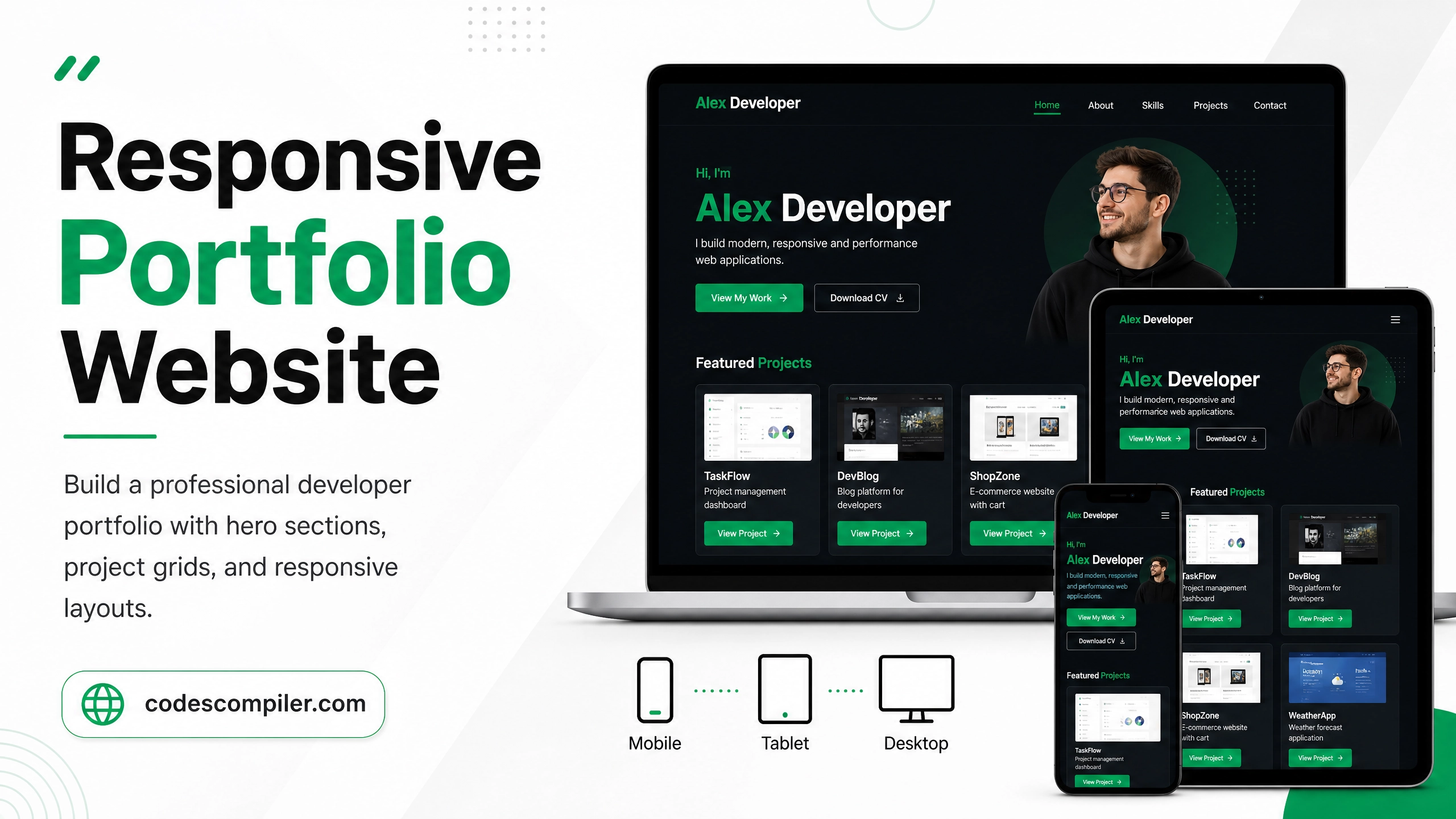
Responsive Portfolio Website with HTML & CSS
Build a professional developer portfolio from scratch — hero section, skills grid, project cards, and contact form. Fully responsive, no frameworks.
Table of Contents
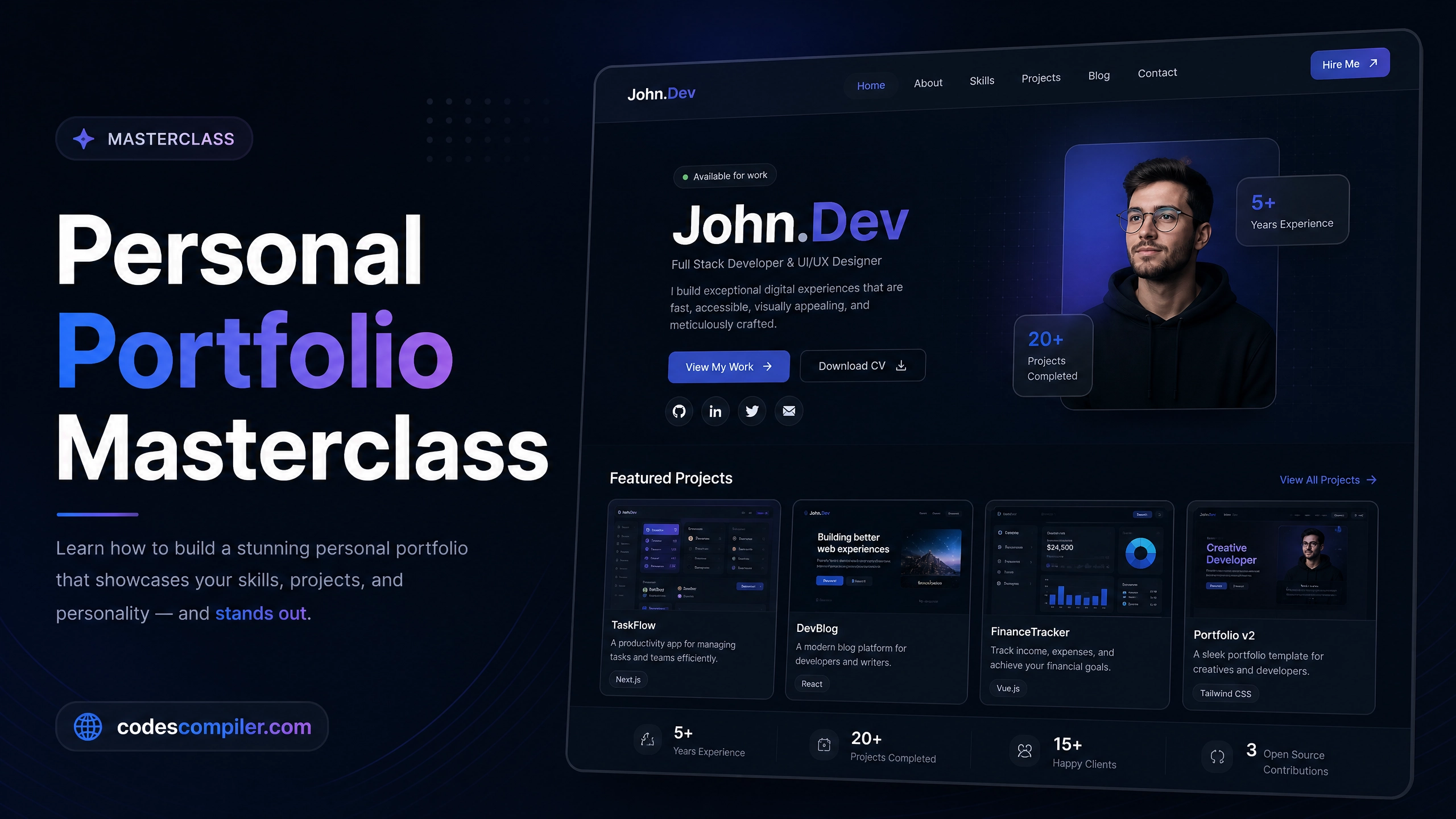
A well-designed portfolio is every developer’s best asset. In this guide we’ll build a fully responsive personal portfolio website with modern design — no CSS frameworks, just clean HTML and CSS.
Page Sections
- Header — Sticky navbar with logo and links
- Hero — Full-screen introduction with CTA
- Skills — Animated skill bars
- Projects — Card grid with hover effects
- Contact — Simple contact form
Hero Section
<section class="hero">
  <div class="hero-content">
    <p class="greeting">Hi, I'm</p>
    <h1>Alex Developer</h1>
    <p class="tagline">I build beautiful, fast websites with <span>HTML</span>, <span>CSS</span> & <span>JavaScript</span>.</p>
    <div class="cta-group">
      <a href="#projects" class="btn-primary">See My Work</a>
      <a href="#contact" class="btn-outline">Contact Me</a>
    </div>
  </div>
</section>
.hero {
  min-height: 100vh;
  display: flex;
  align-items: center;
  background: linear-gradient(135deg, #1a1a2e 0%, #16213e 100%);
  padding: 80px 24px 40px;
}

.hero h1 {
  font-size: clamp(40px, 8vw, 72px);
  font-weight: 900;
  color: #fff;
  line-height: 1.1;
}

.hero .tagline span { color: #04AA6D; }

.btn-primary {
  padding: 14px 32px;
  background: #04AA6D;
  color: #fff;
  border-radius: 8px;
  font-weight: 700;
  text-decoration: none;
  transition: transform .2s, box-shadow .2s;
}
.btn-primary:hover {
  transform: translateY(-3px);
  box-shadow: 0 12px 24px rgba(4,170,109,0.3);
}
Projects Grid
.projects-grid {
  display: grid;
  grid-template-columns: repeat(auto-fit, minmax(280px, 1fr));
  gap: 24px;
}

.project-card {
  background: #fff;
  border-radius: 16px;
  overflow: hidden;
  box-shadow: 0 2px 12px rgba(0,0,0,.08);
  transition: transform .3s, box-shadow .3s;
}
.project-card:hover {
  transform: translateY(-6px);
  box-shadow: 0 16px 40px rgba(0,0,0,.15);
}

.project-image {
  width: 100%;
  height: 180px;
  object-fit: cover;
}

.project-info { padding: 20px; }
.project-info h3 { font-size: 18px; font-weight: 700; margin-bottom: 8px; }
.project-tags { display: flex; gap: 8px; flex-wrap: wrap; margin-top: 12px; }
.tag {
  font-size: 11px;
  font-weight: 700;
  padding: 3px 10px;
  background: #f0fdf4;
  color: #04AA6D;
  border-radius: 20px;
}
Responsive Layout
@media (max-width: 768px) {
  .hero-content { text-align: center; }
  .cta-group { flex-direction: column; align-items: center; }
  .skills-grid { grid-template-columns: 1fr; }
}
Pro Tip: Host your portfolio on GitHub Pages for free! Push to a repo named
username.github.ioand it’s live instantly.